Overview
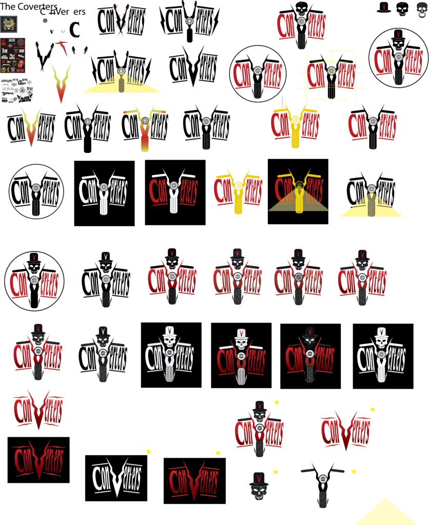
My mission for this project was to craft a dynamic logo for “The Converters,” a classic rock band captivating audiences aged 25-60 with their electrifying blend of rock, blues, and biker music with and edgy touch. I had total creative freedom over how the word converters was interpreted in the design of the logo but had to create a visually impactful and instantly recognizable logo that would embody their raw energy and resonate with their diverse fanbase.
Inspiration and Sketching
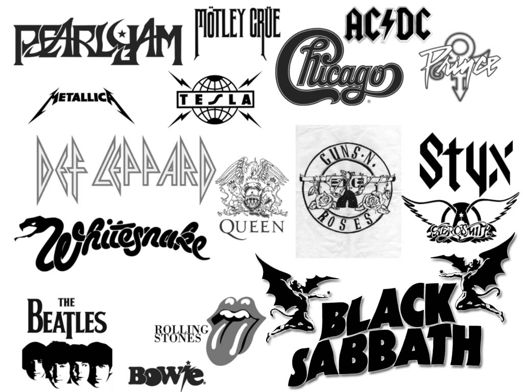
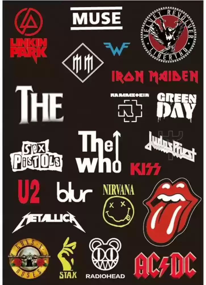
For my design I embraced sharp, edgy design elements reminiscent of classic rock titans. This aesthetic choice wasn’t just a homage to rock history, but a strategic decision to visually translate the electrifying power and transformative spirit embedded in the ‘Converters’ name. By injecting bold lines and dynamic angles, I aimed to forge a logo that resonates with the audience’s love for classic rock while hinting at the band’s own modern edge.
Final Design
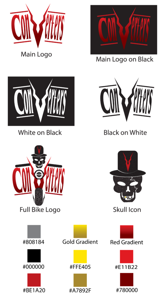
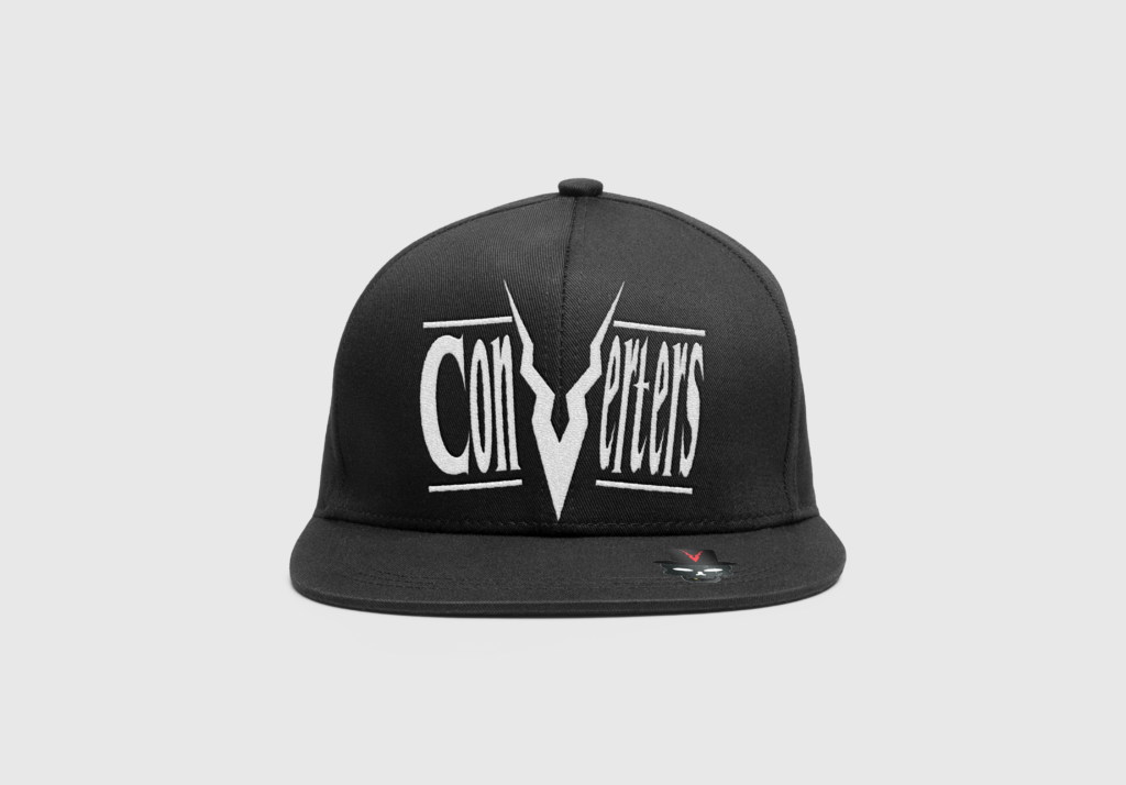
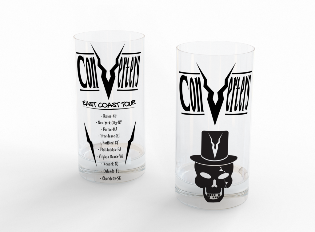
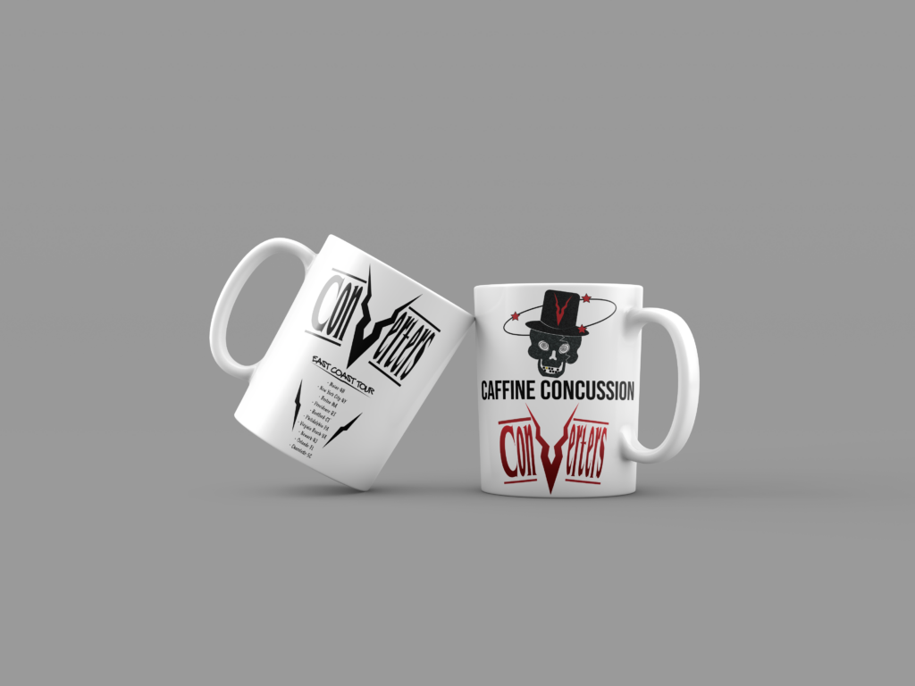
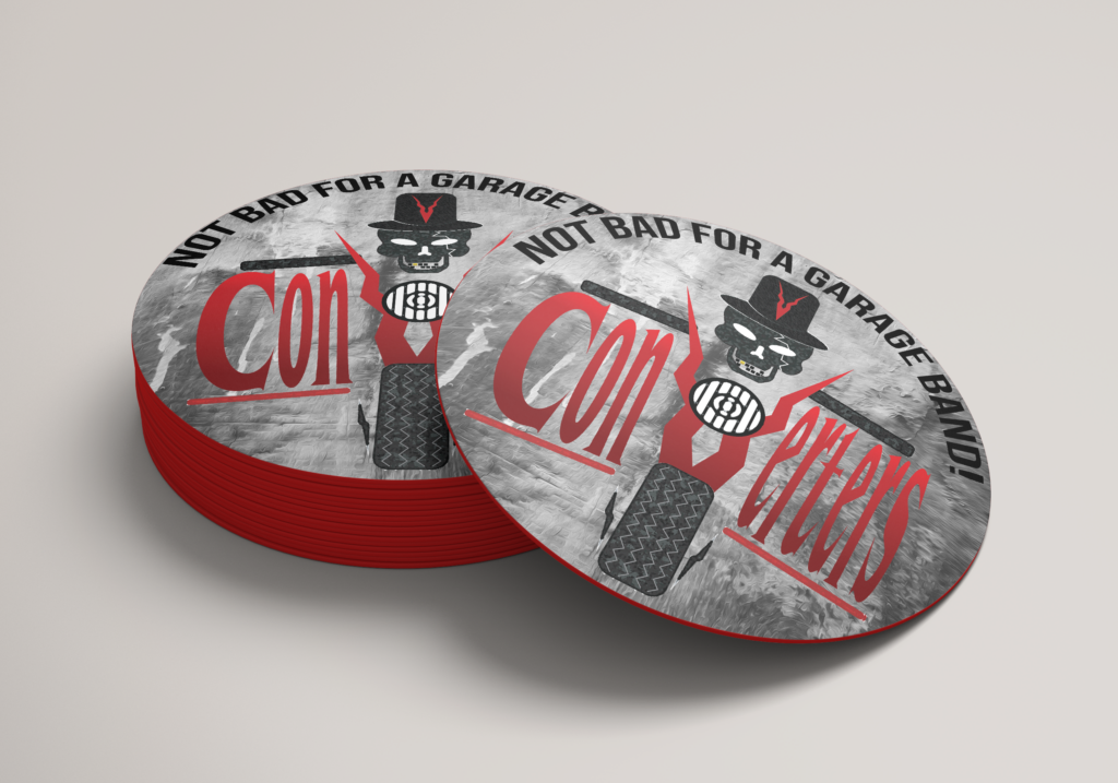
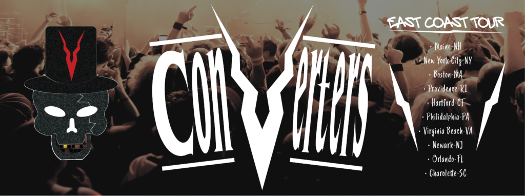
For my final design I used the logo with and without the extra graphics of the bike and skull. The logo fits the themes of biker, edgy, blues, rock aesthetic and relates to other logos in its genre. The less graphic logo is used more for the merchandise since it has less colors and is more recognizable/readable.
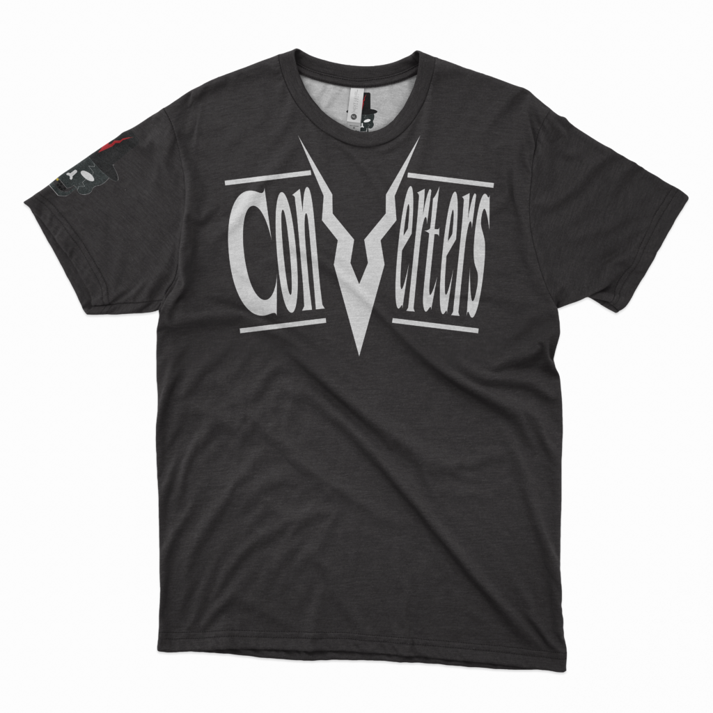
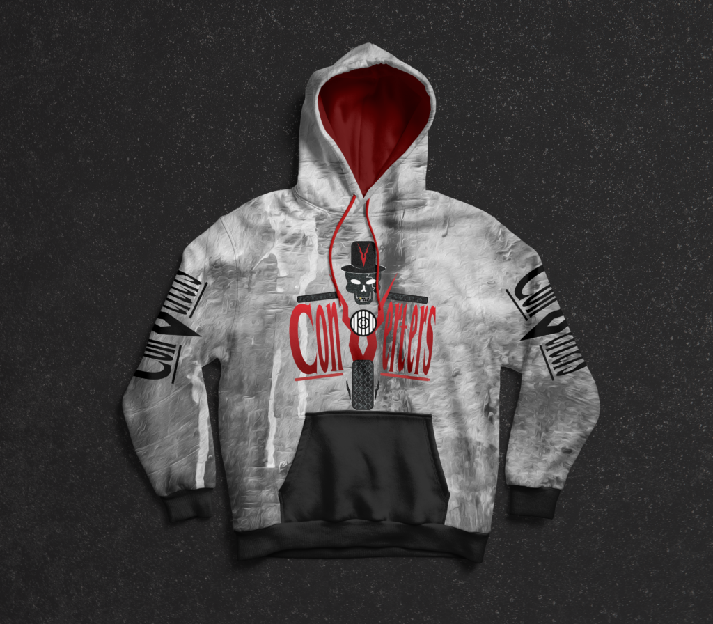
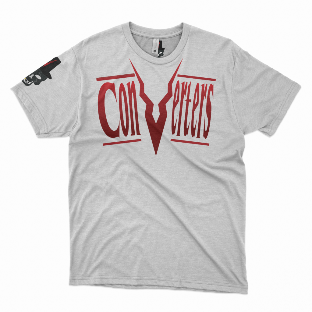
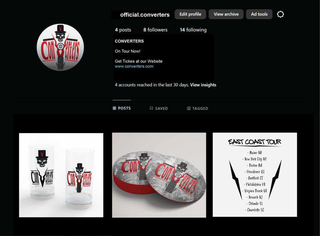
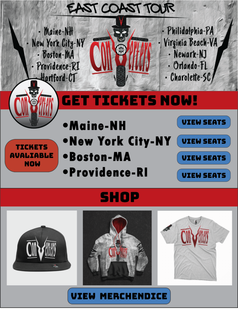
Merchandise Mock-Ups

Social Media Mock-Ups
Feedback
The feedback from my logo and mockups was received well. The logo fits the themes and has a unique recognizable style that will resonate with its audience. I really enjoyed the process of creating this logo as I listen to lost of classic rock and like do edgy/grungy designs. This project taught me a lot about time tracking and time management as this was a major part of the assignment and is crucial for real world work.